To me, the word "abstract" means an unusual, surreal (unreal) photo, drawing or painting. Abstraction/ abstract photos, books and abstract paintings are things that I find interesting. I enjoy taking pictures and cutting and playing around with them, or in some cases take photographs that confuse the viewer, where you just can't tell what the picture is of, or you can't clearly see a subject. I class photos like this as abstract photographs.
The Formal Elements
Photographers are usually aware of ways to make their pictures interesting apart from the subject of the photo. This is what makes good and bad photographs out of taking a few pictures of the same thing. The list below is how you could look at a photo to get the image meaning by looking for these specific things.
Focus: Which areas appear clearest or sharpest in the photograph? Which do not?
Light: Which areas of the photograph are brightest? Are there any shadows? Does the photograph allow you to guess the time of day? Is the light natural or artificial? Harsh or soft? Reflected or direct?
Line: Are there objects in the photograph that act as lines? Are they straight, curvy, thin, thick? Do the lines create direction in the photograph? Do they outline? Do the lines show movement or energy?
Repetition: Are there any objects, shapes or lines which repeat and create a pattern?
Shape: Do you see geometric (straight edged) or organic (curvy) shapes? Which are they?
Space: Is there depth to the photograph or does it seem shallow? What creates this appearance? Are there important negative (empty) spaces in addition to positive (solid) spaces? Is there depth created by spatial illusions i.e. perspective?
Texture: If you could touch the surface of the photograph how would it feel? How do the objects in the picture look like they would feel?
Value/Tone: Is there a range of tones from dark to light? Where is the darkest value? Where is the lightest?
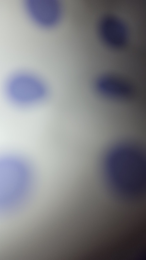
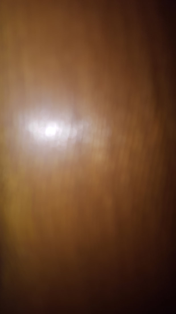
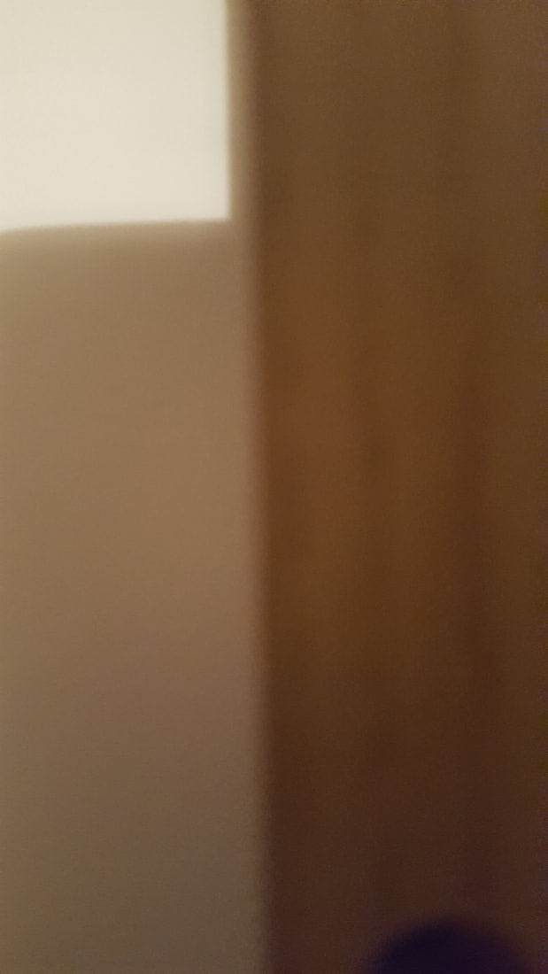
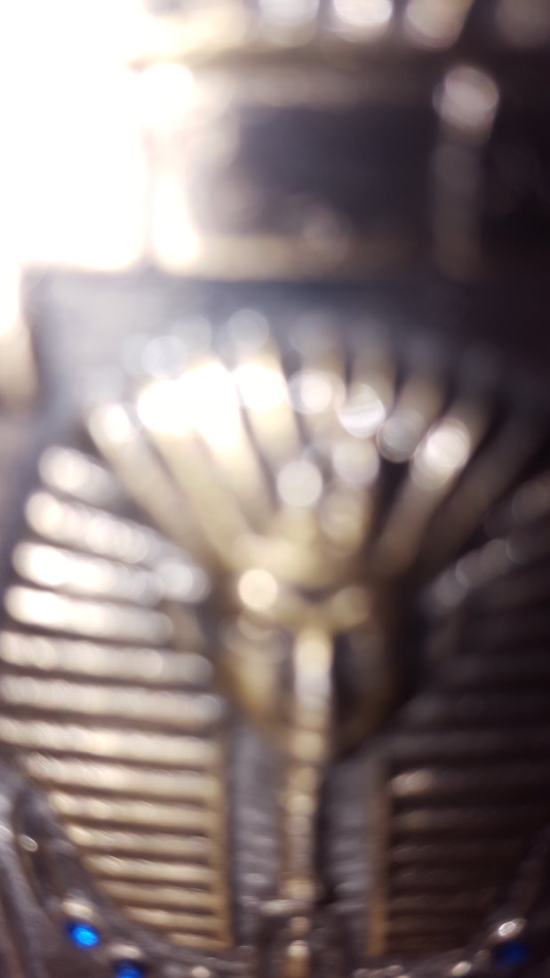
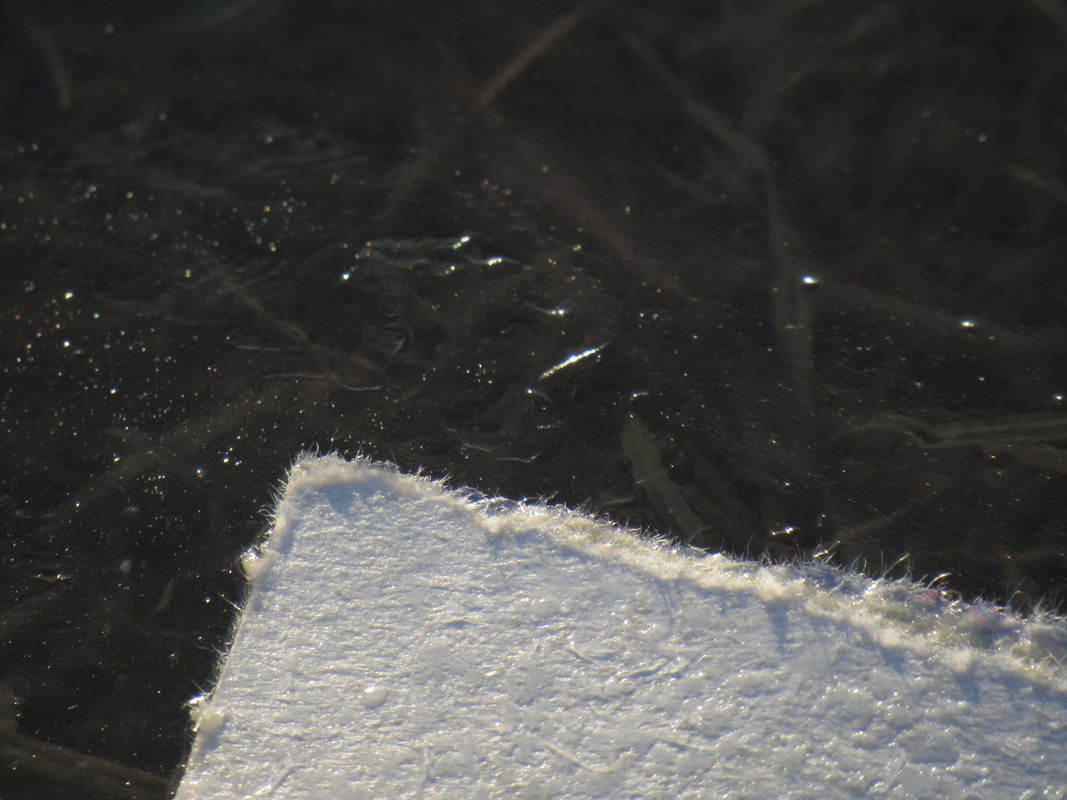
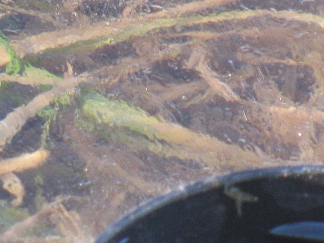
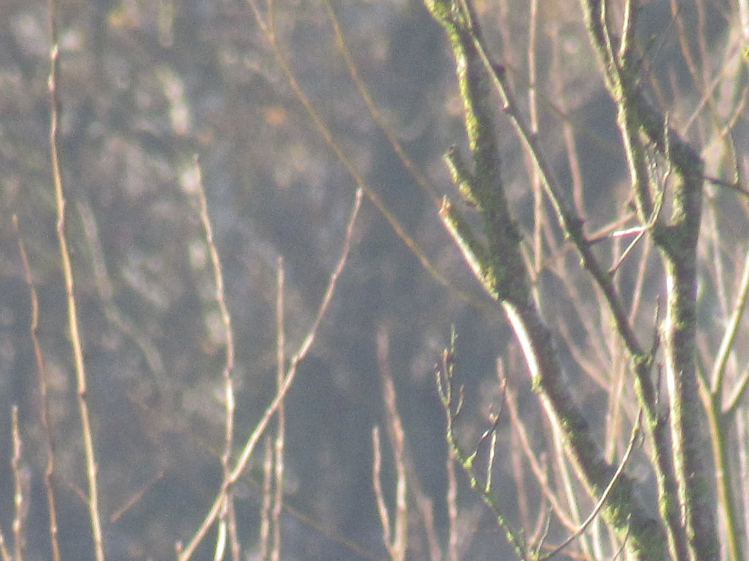
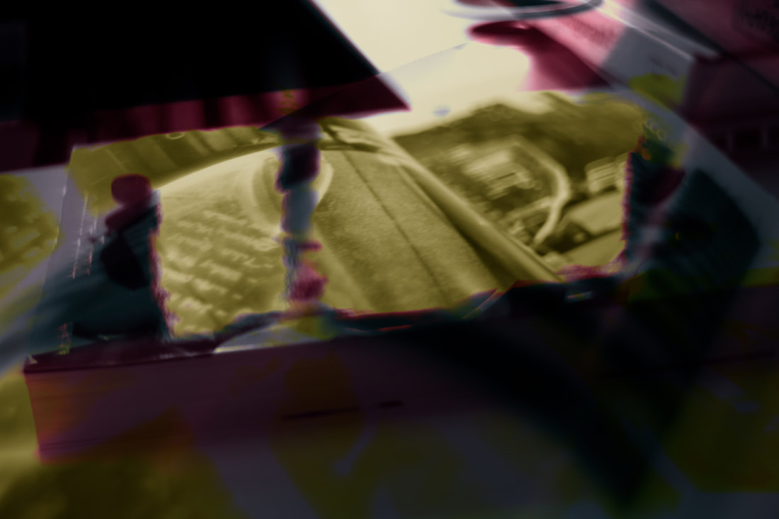
Below are some abstract photographs that I took in a GCSE photography lesson. Some are much more abstract then others.
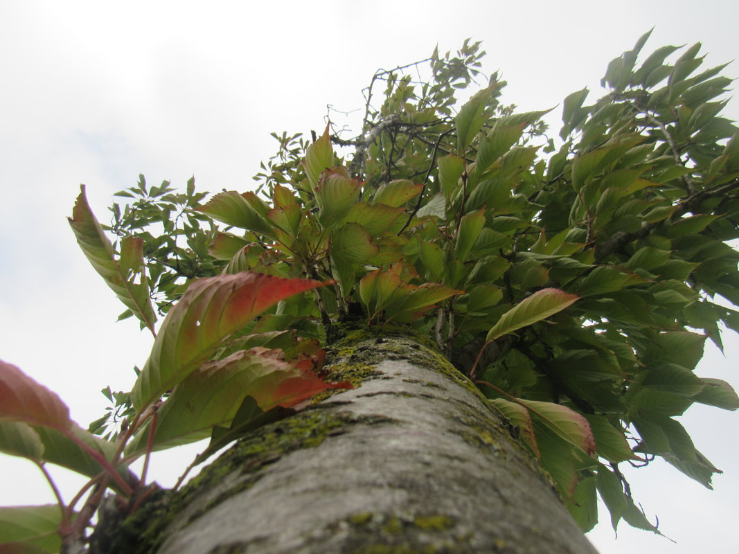
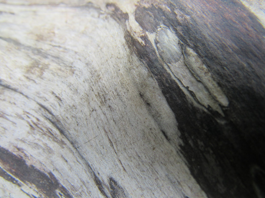
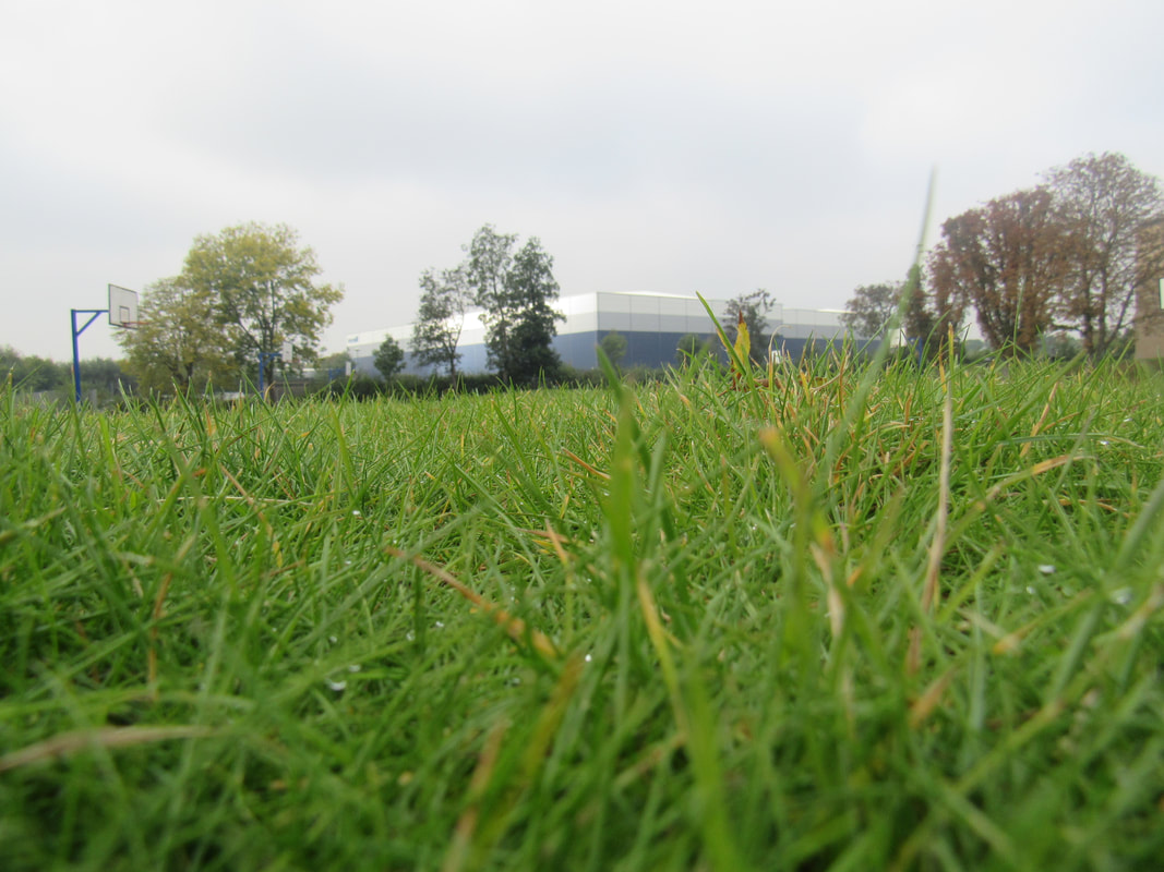
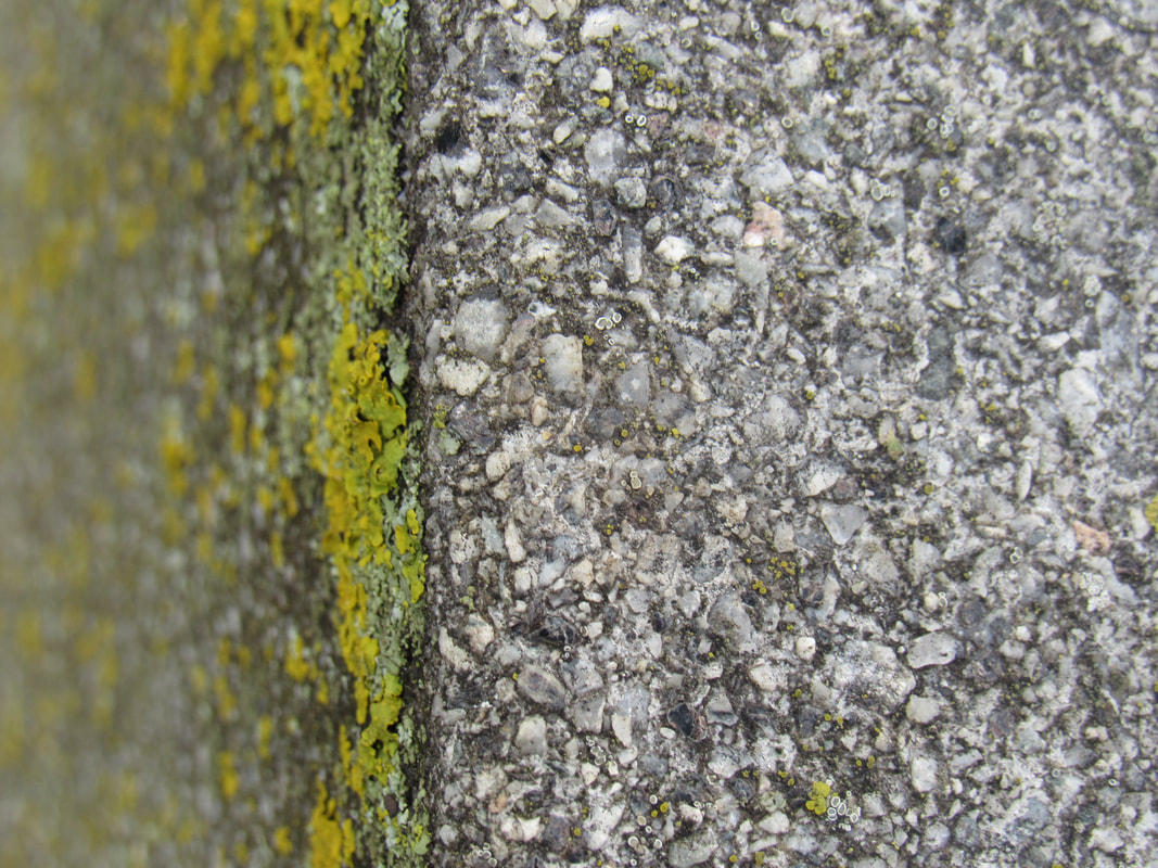
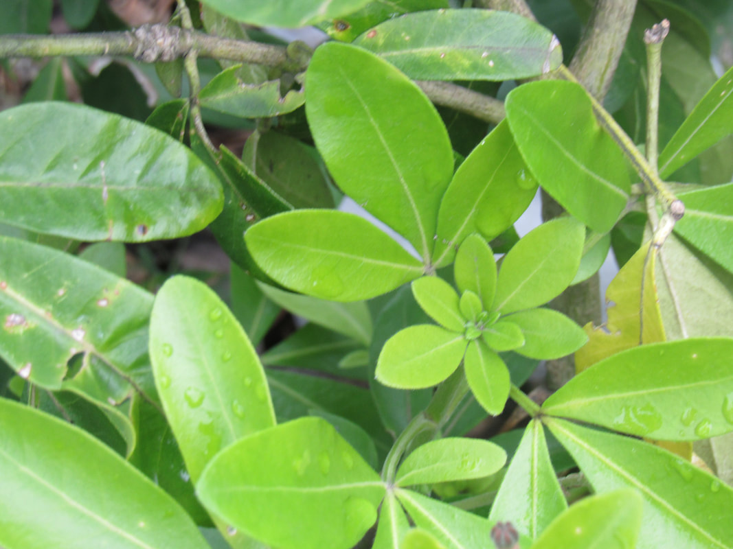
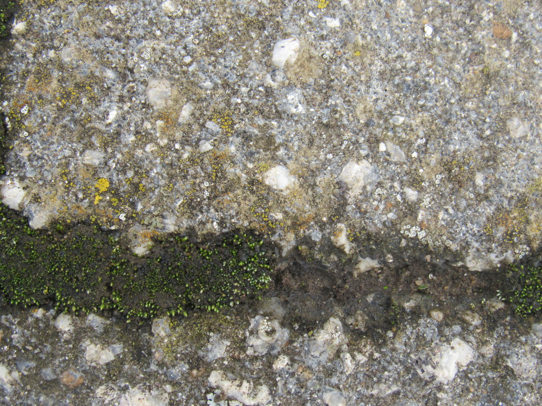
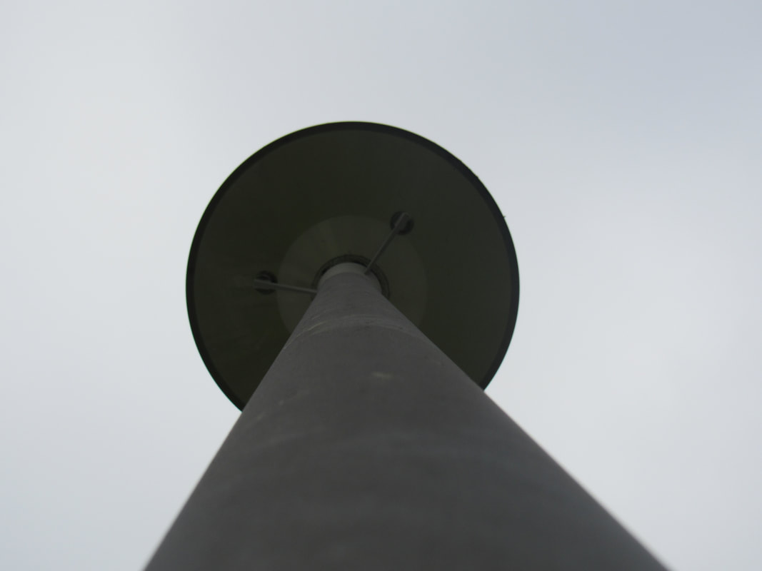
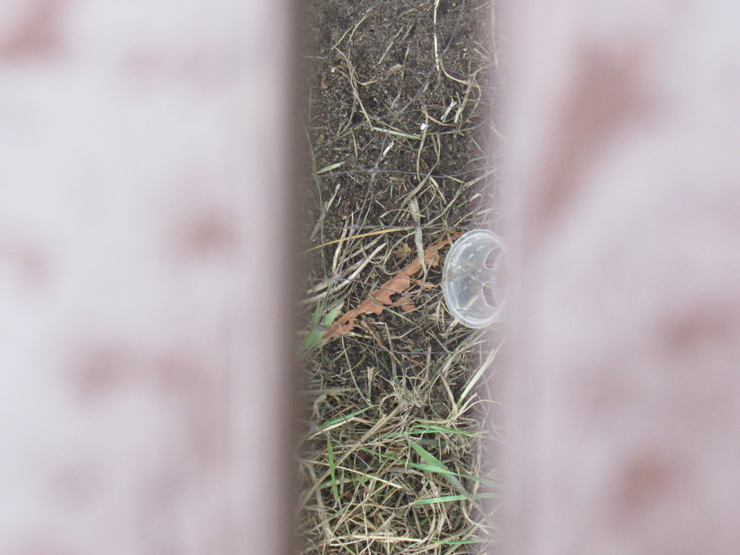
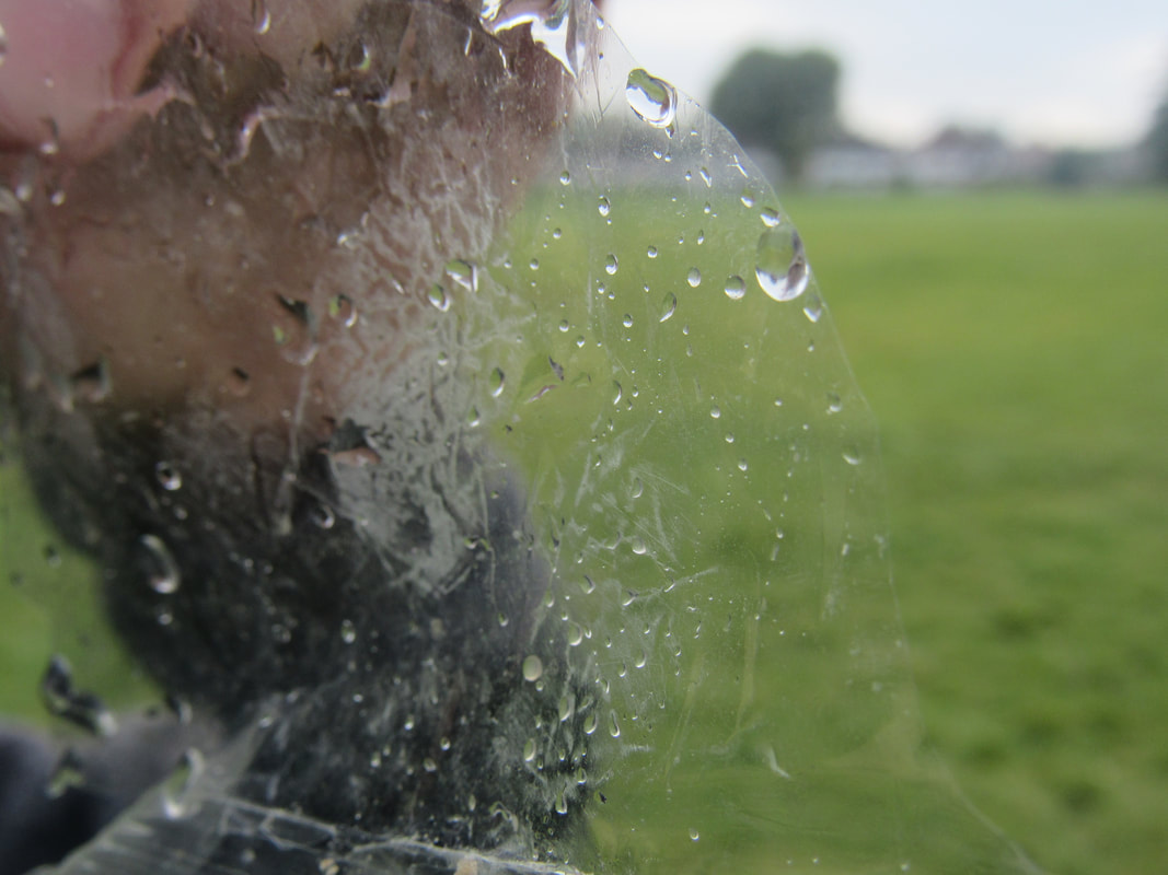
WWW: I took some good abstract pictures that don't show much, not a lot of space so you can't tell what or where it is. I also did the opposite, I took a picture with a lot of space, that are not abstract at all.
EBI: I could be more creative and make these pictures more abstract by using photoshop.
EBI: I could be more creative and make these pictures more abstract by using photoshop.
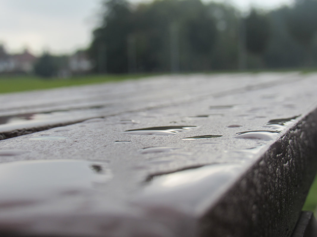
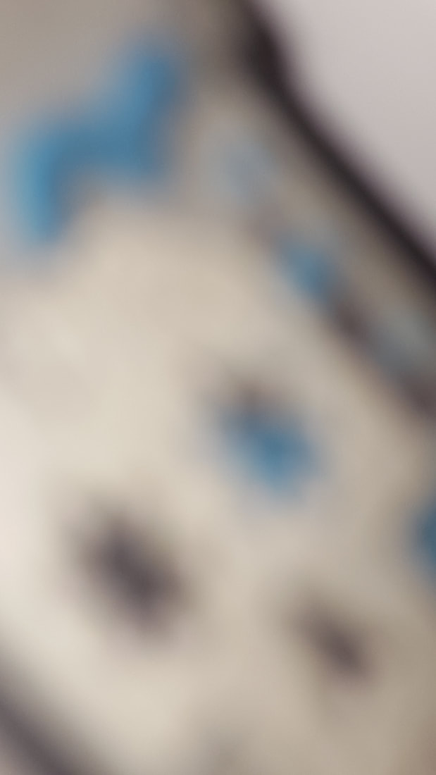
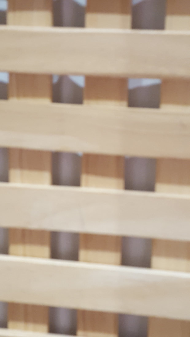
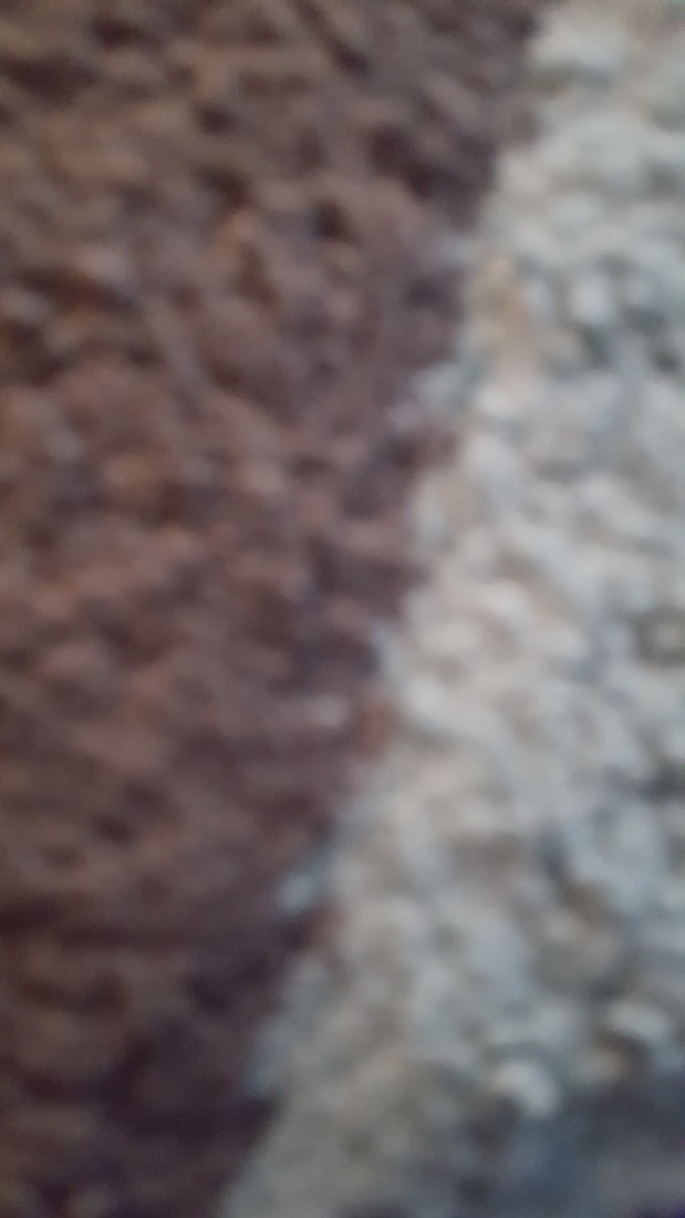
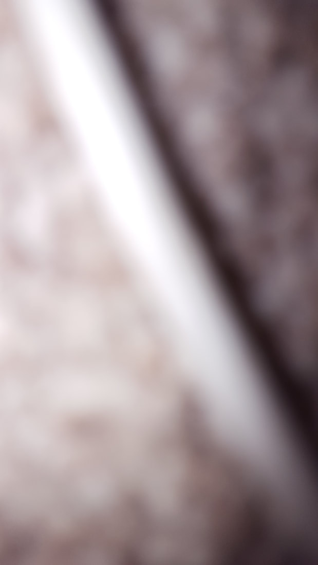
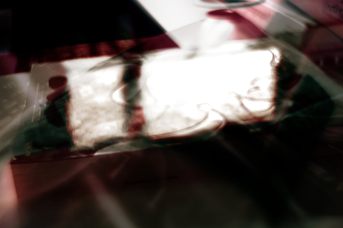
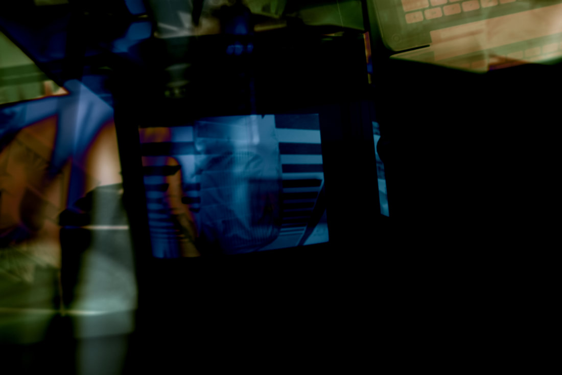
Below are some abstract pictures I was asked to take at home as a part of my GCSE photography homework
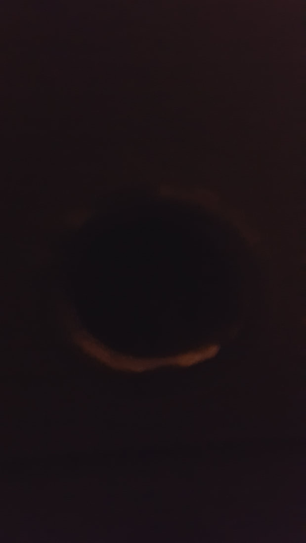
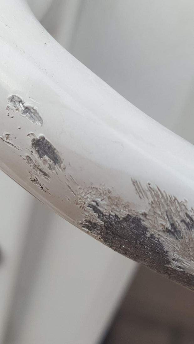

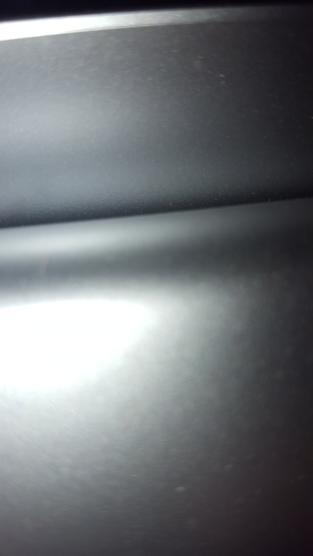
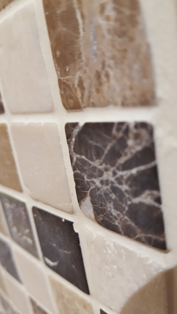
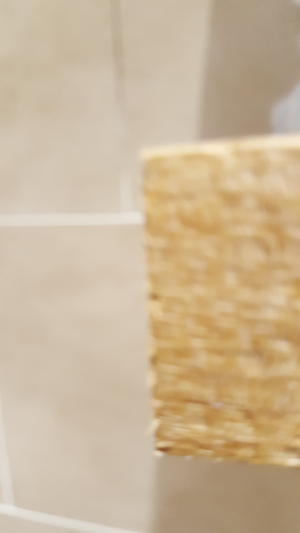
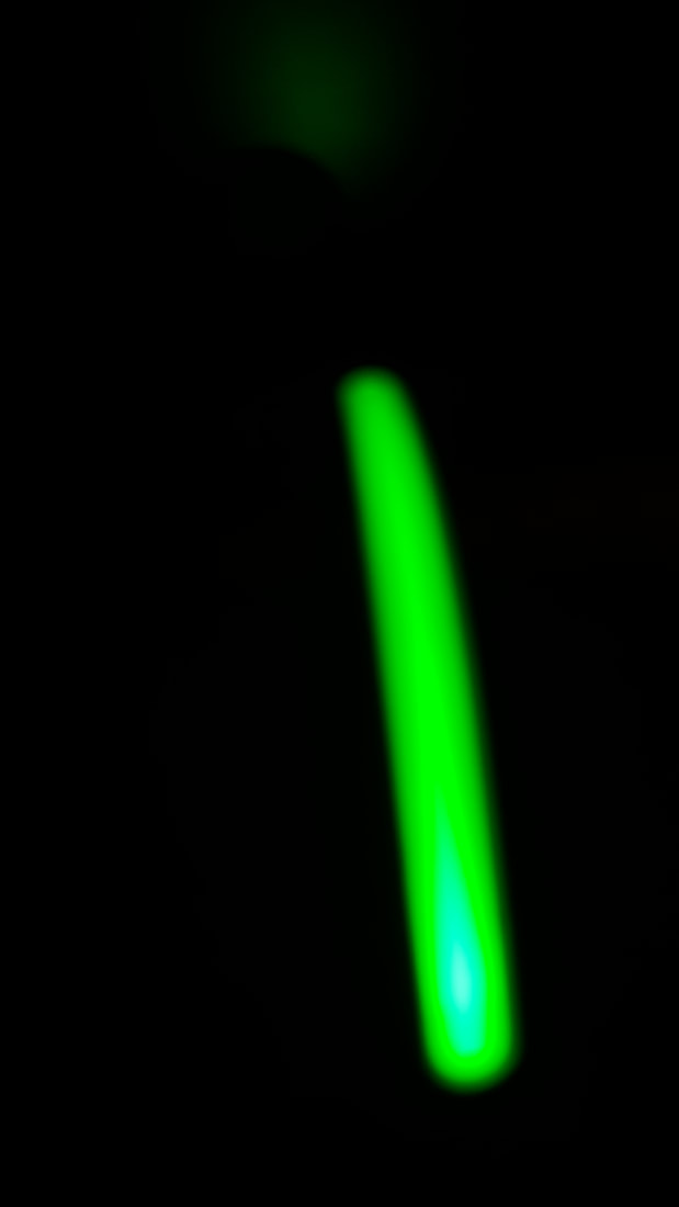
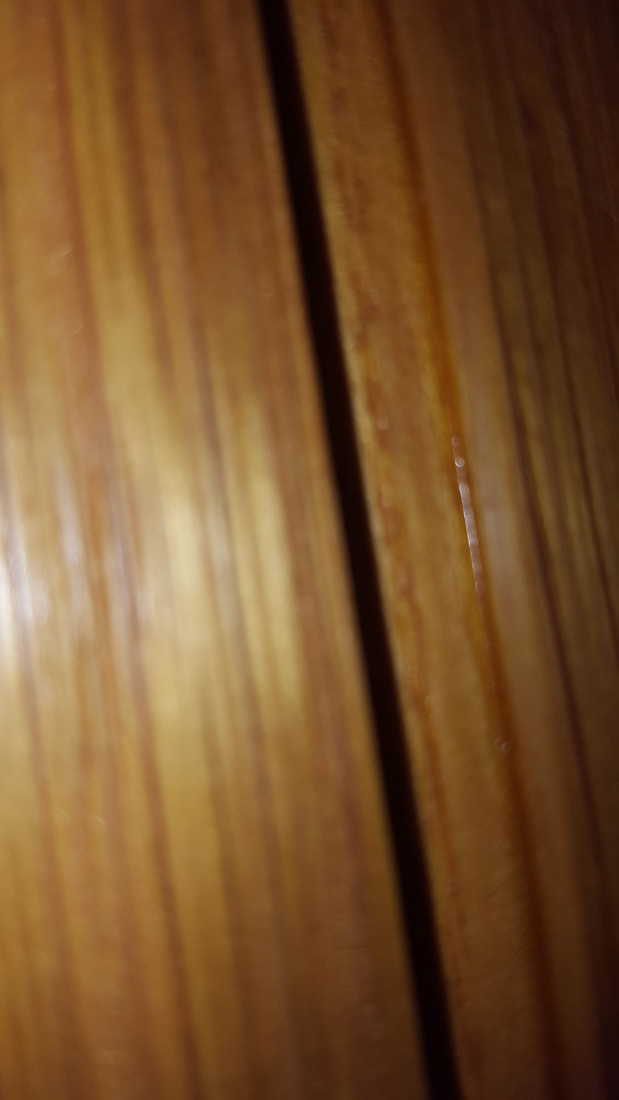
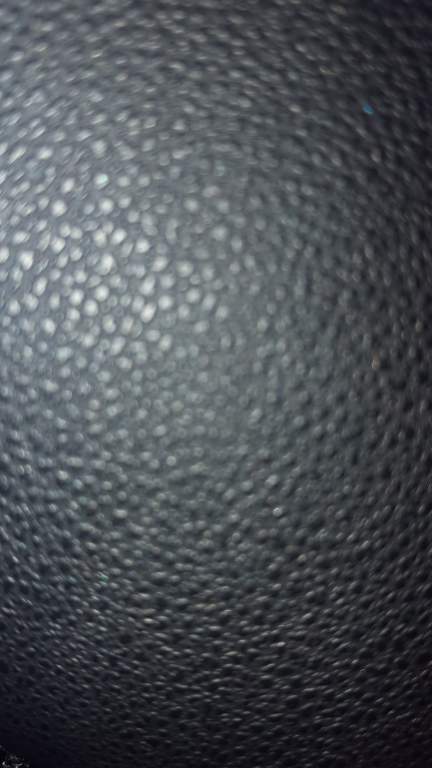
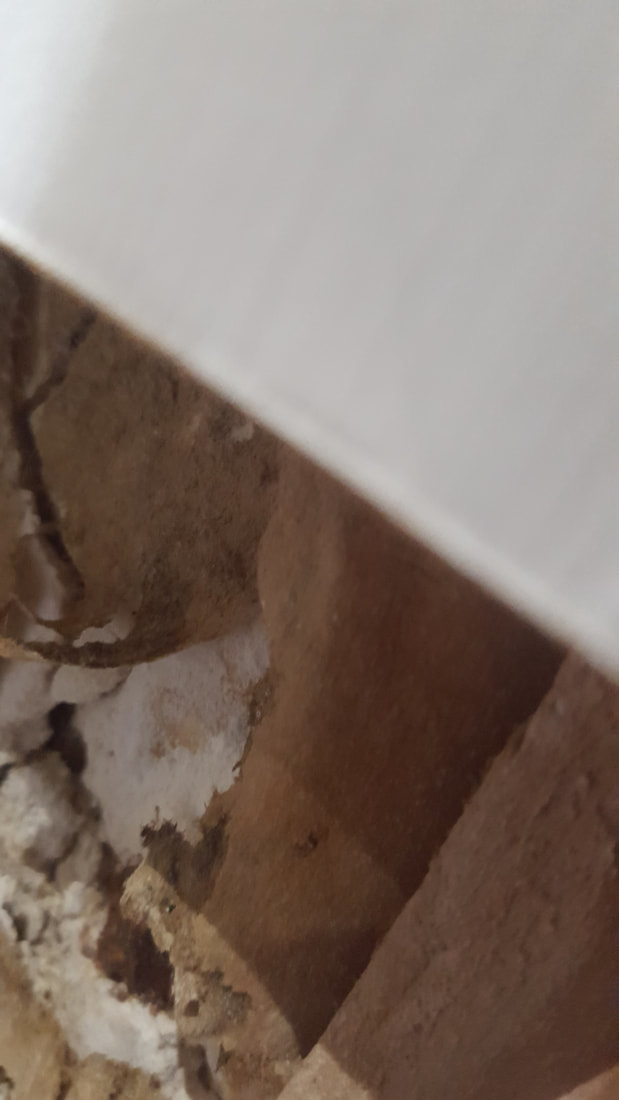
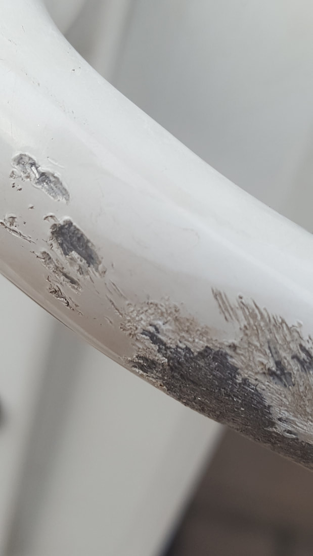
Out of all abstract photos I took above I think these two are the best. This is because you cannot tell what the subject of the picture is, if there is one, because of the fact that there is not much shown in these photos, they are not very revealing.
Was went well is that most of the pictures have turned out abstract in my eyes, which was my aim.
It would be even better if I took some more photographs that were in focus.
Was went well is that most of the pictures have turned out abstract in my eyes, which was my aim.
It would be even better if I took some more photographs that were in focus.
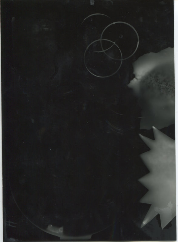
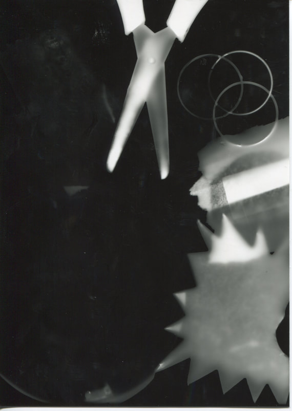

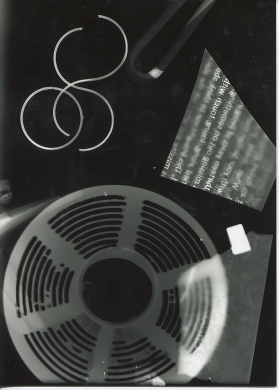
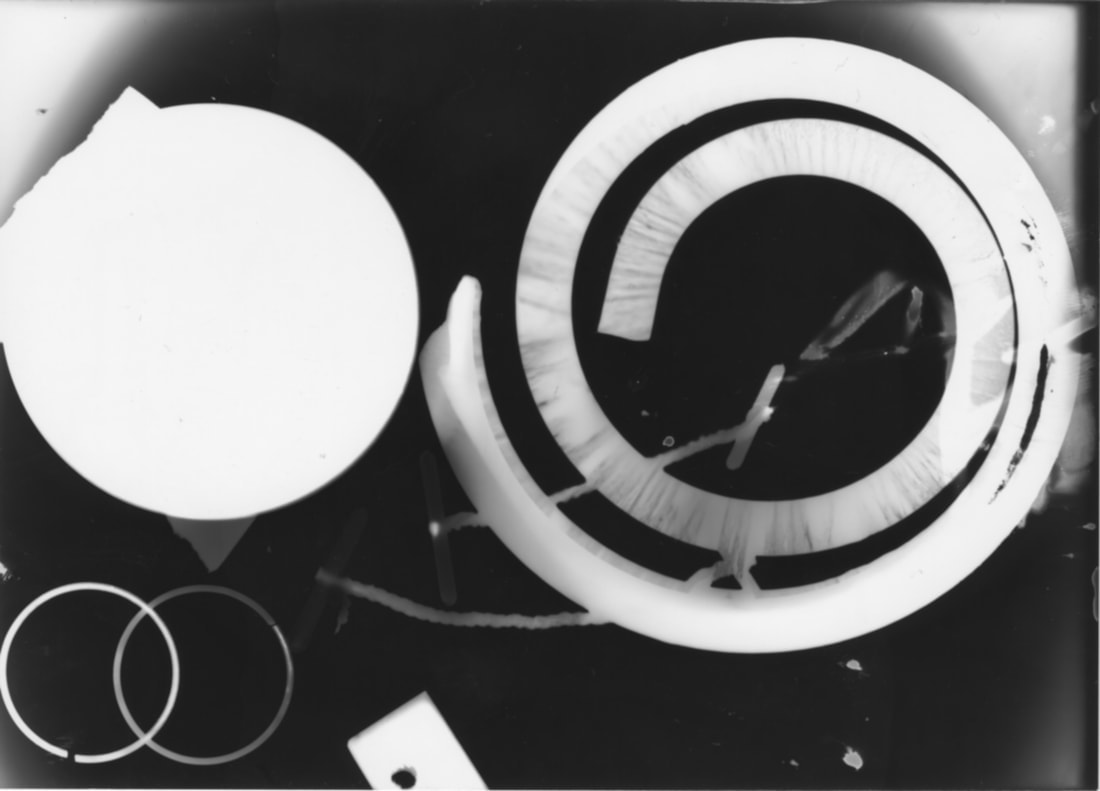
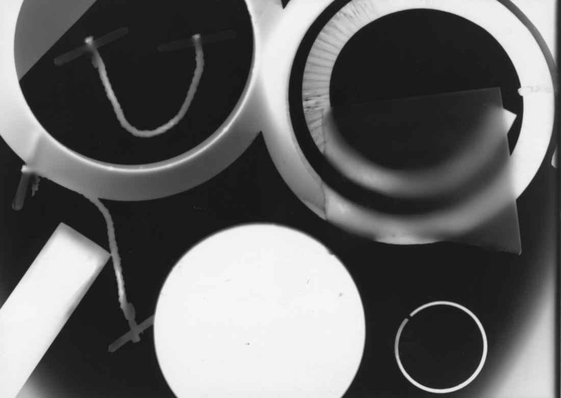
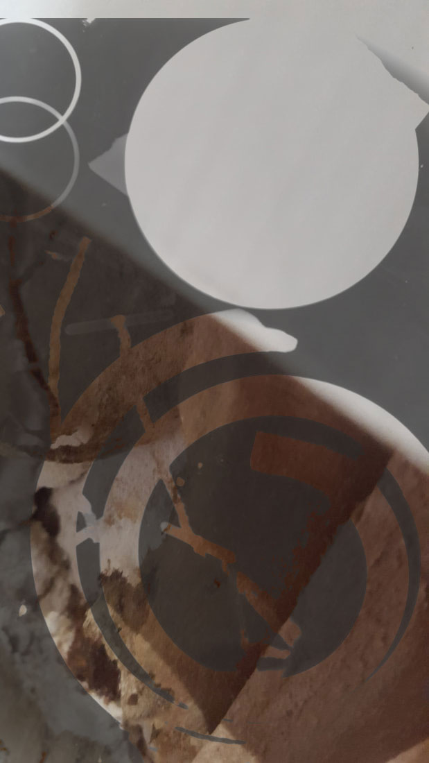
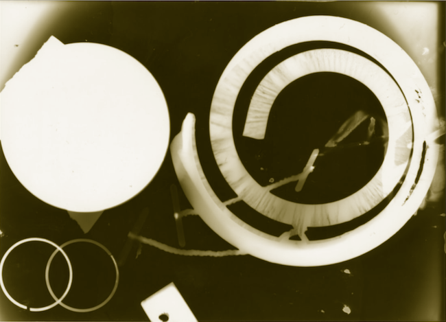
I made the abstract photograms above in a photography lesson. I am cutting these up and experimenting with them, refining them, using photoshop to edit them, to create a duotone. These photograms will also appear on my final outcome board.
It would be better if these photograms were more abstract, which I something I will work on as I am trying to experiment more in the dark room.
It would be better if these photograms were more abstract, which I something I will work on as I am trying to experiment more in the dark room.
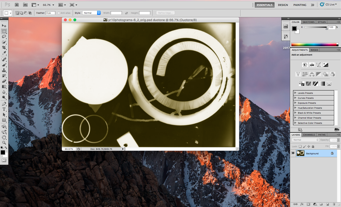
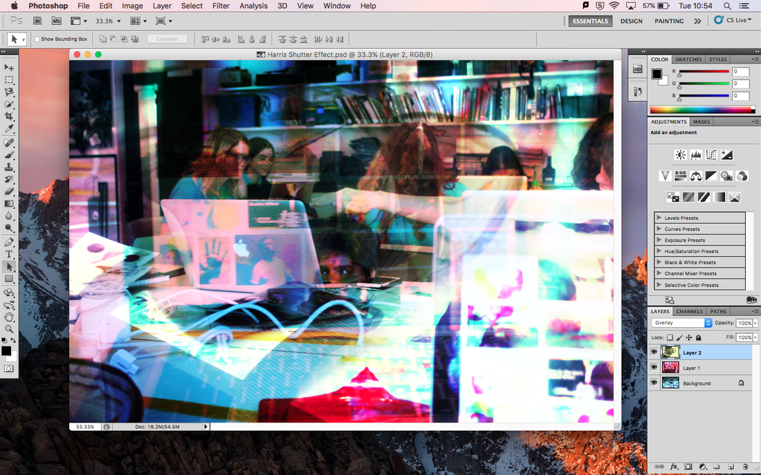
The duotone and overlay shown below which I made in photoshop will also be shown on my final outcome board. I am leased with how the duotone turned out, however it would be even better if I learnt some new skills to use on photoshop

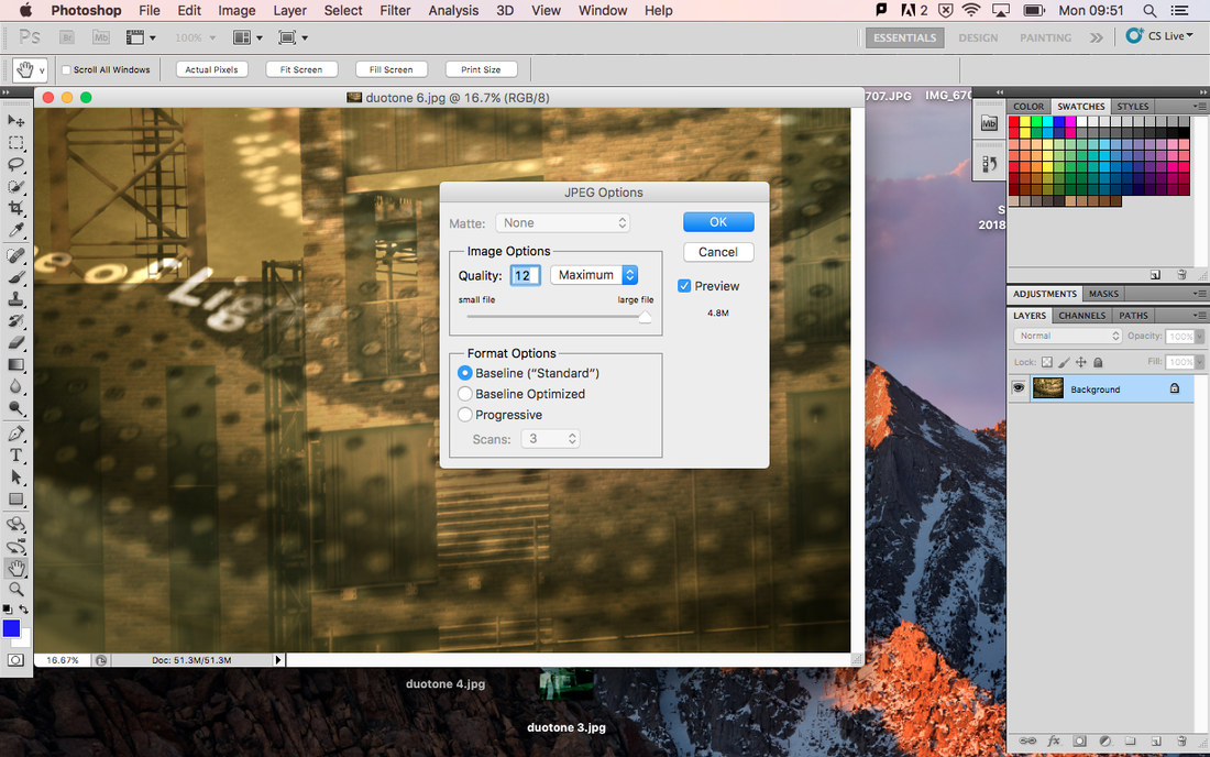
Below is a screenshot of when I was making my duotone in photoshop.
Here is some work by Wolfgang Tillmans that has inspired me because of the layouts of his exhibition installations.
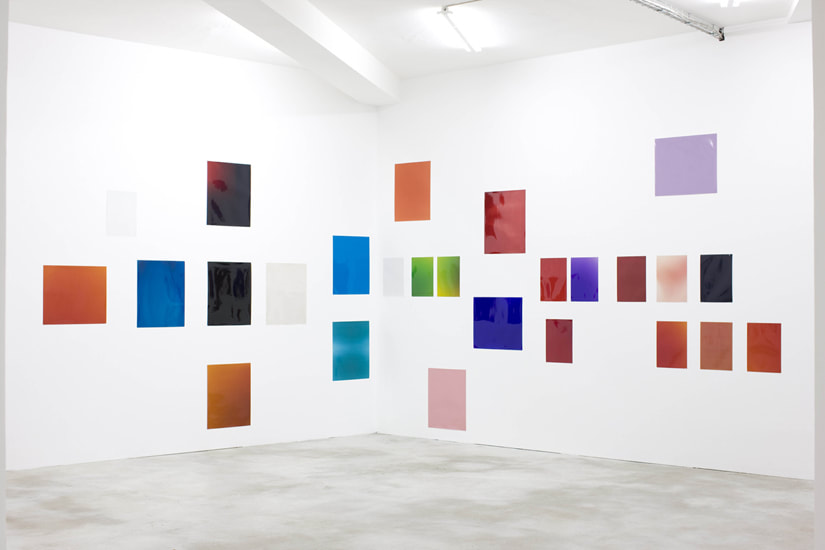
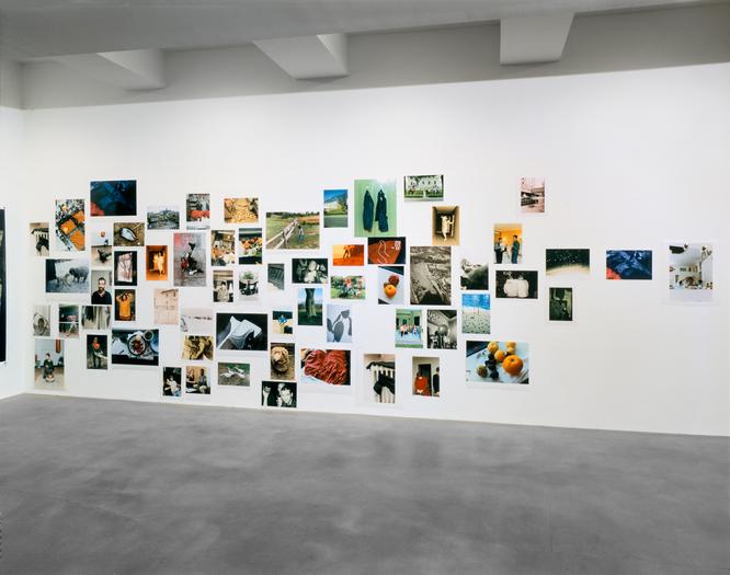
Tillmans was the first photographer and non British person to be awarded he Tate annual Turner Prize. He has also been awarded with the Royal Photographic Society's Centenary Medal and is a member of the Royal Academy of Arts. Some abstract photography by Wolfgang Tillmans is shown below.
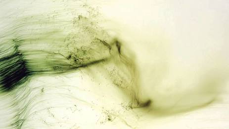
Freischwimmer 54 - 2004
|
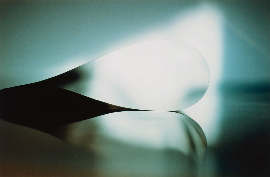
Paper Drop (Window) - 2006
|
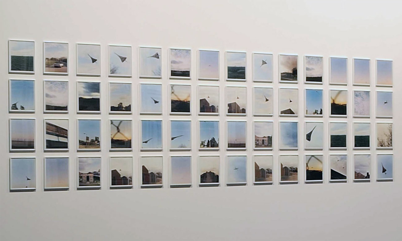
Tillmans first exhibited his abstract pictures in 1998 in the Parkett edition. This edition included 60 different photographs on colour negative photographic paper and was a combination of dark room mistakes.
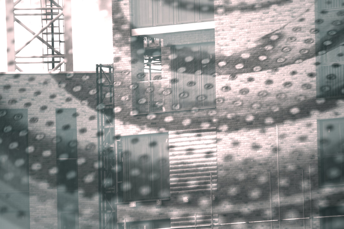
Here are some abstract pictures that I took in a photography lesson. They are abstract because they are not revealing and you cannot tell what they really are because of the zoom function on the camera.
What went well is that I managed to create abstract photographs by experimenting with different functions of the camera.
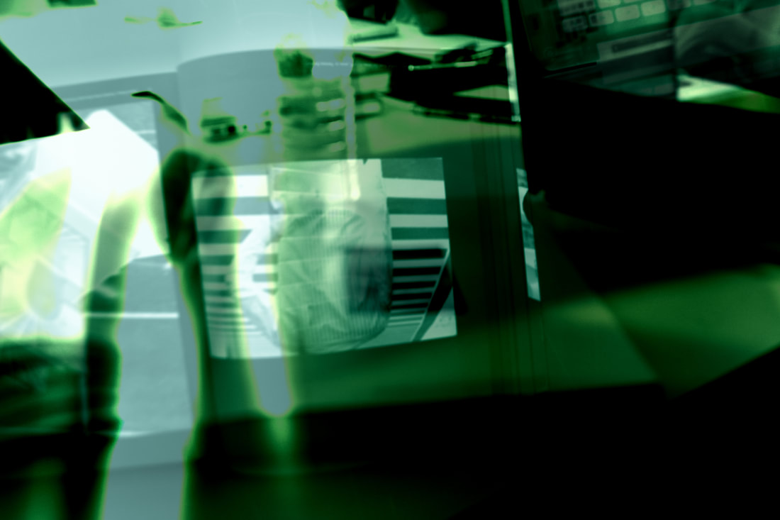
I am experimenting with layers in photographs to come out with a final outcome in abstraction in photography. The duotone I made in a previous project this year is shown below, and is an example of layers.
The Harris Shutter Effect
Below is my first attempt at the Harris Shutter effect using photoshop. This effect combines three photographs together of different colours (Blue, red and yellow). As this was my first attempt, it was just pictures that I quickly took from my seat in the classroom that were used, so it is not the best example. The effect works better on pictures of the outside world , with pictures of things such as buildings.
My Final Outcome
Currently in my GCSE abstraction project I am making a final outcome. My final outcome is some harris shutter effect duotones I have made printed onto a big piece of cartridge paper. The duotones I have created are shown below.
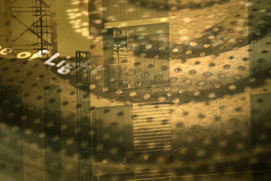
The screenshot below shows the the end of the process of making one of the duotones using photoshop.
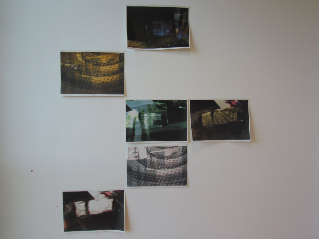
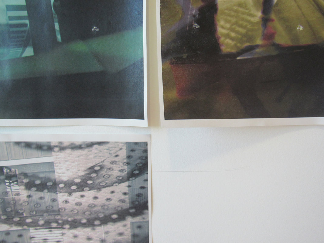
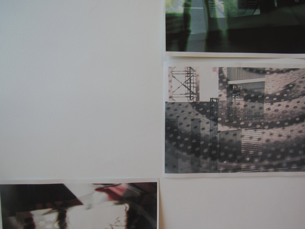
This is the main photograph of my final outcome. They are displayed in this strange shape because this way not only the duotones are abstract, but the shape in which they are shown is also abstract. More pictures of my final outcome are shown below. I took pictures from a closer range showing different parts of my work.
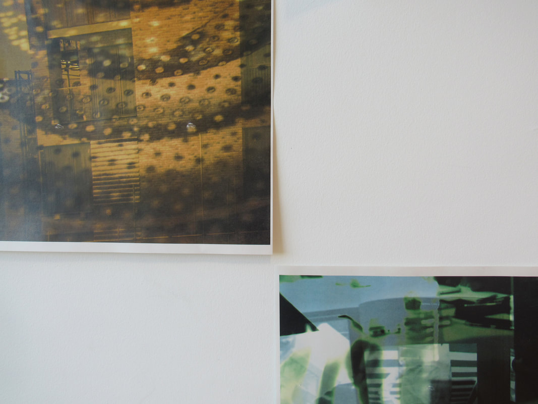
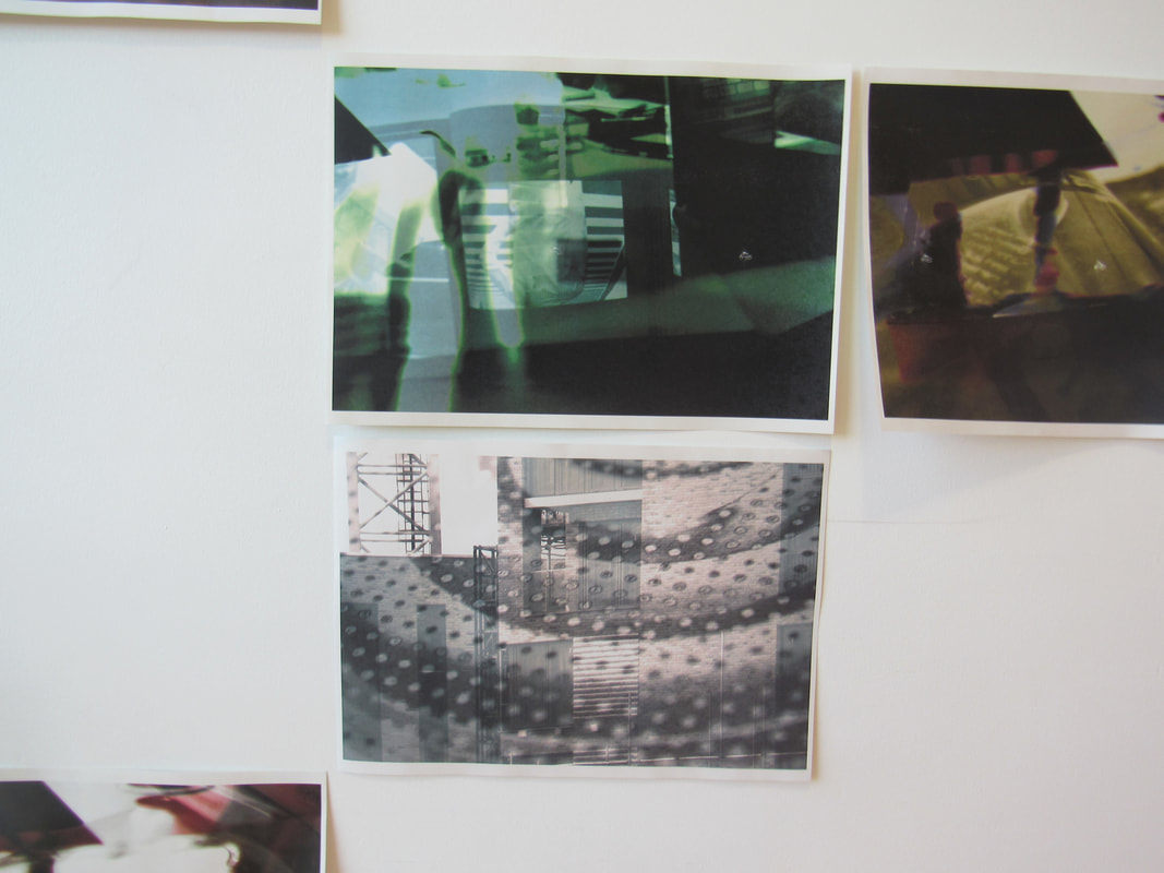
The two photographs on the left make a good diptych.
Evaluation
This final outcome has taught me that if you put in some effort, you will get rewarded in the end. The images are abstract because you would not expect to see them anywhere, they are different from others, which makes them stand out.
